
DIE SCHEUCHE: Märchen. [THE SCARECROW: A Fairytale].
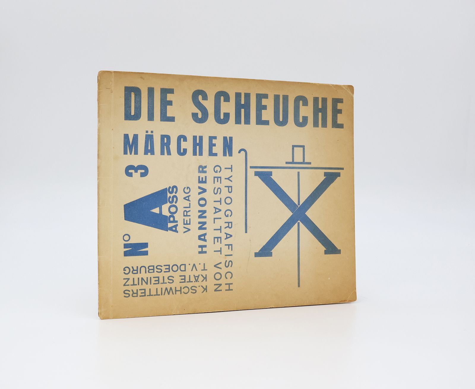
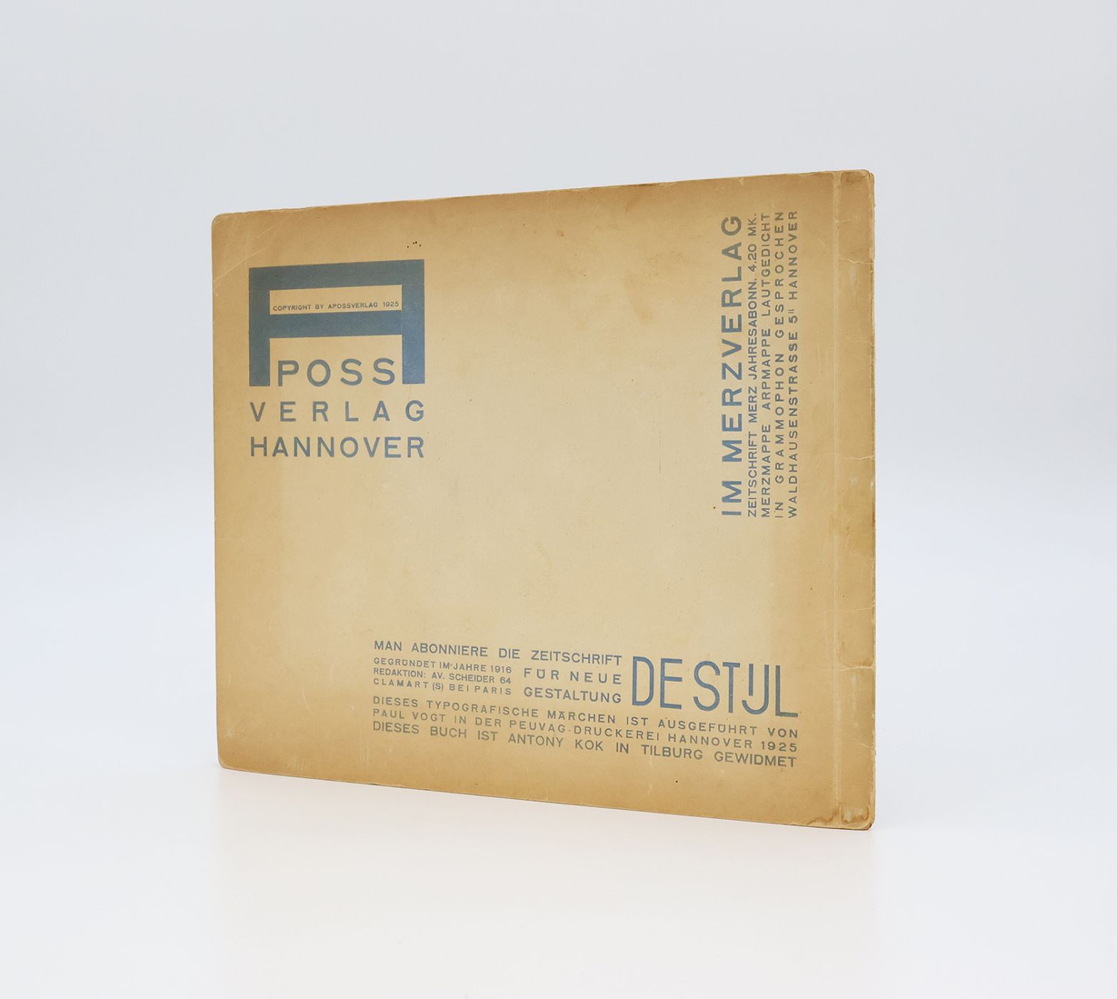
First edition. Publishers original card wraps with letterpress blue titles and typographic scarecrow illustration to the upper panel. 12pp. Perfect Bound. Octavo 20.5cm x 24.5cm. Text in German. Typographic figurative illustrations throughout with alternating blue and red letterpress designs. A genuinely better than very good copy, the binding firm with some splits to the spine ends (3cm) and a little rubbing and creasing to the extremities. The poor quality paper stock is toned, as usual. The contents, with a small area of foxing to the lower corner of the inside cover and a small chip to the top corner of the first page, are otherwise clean throughout and without inscriptions or stamps. An attractive example of this fragile publication, in entirely original condition, without repair or restoration.
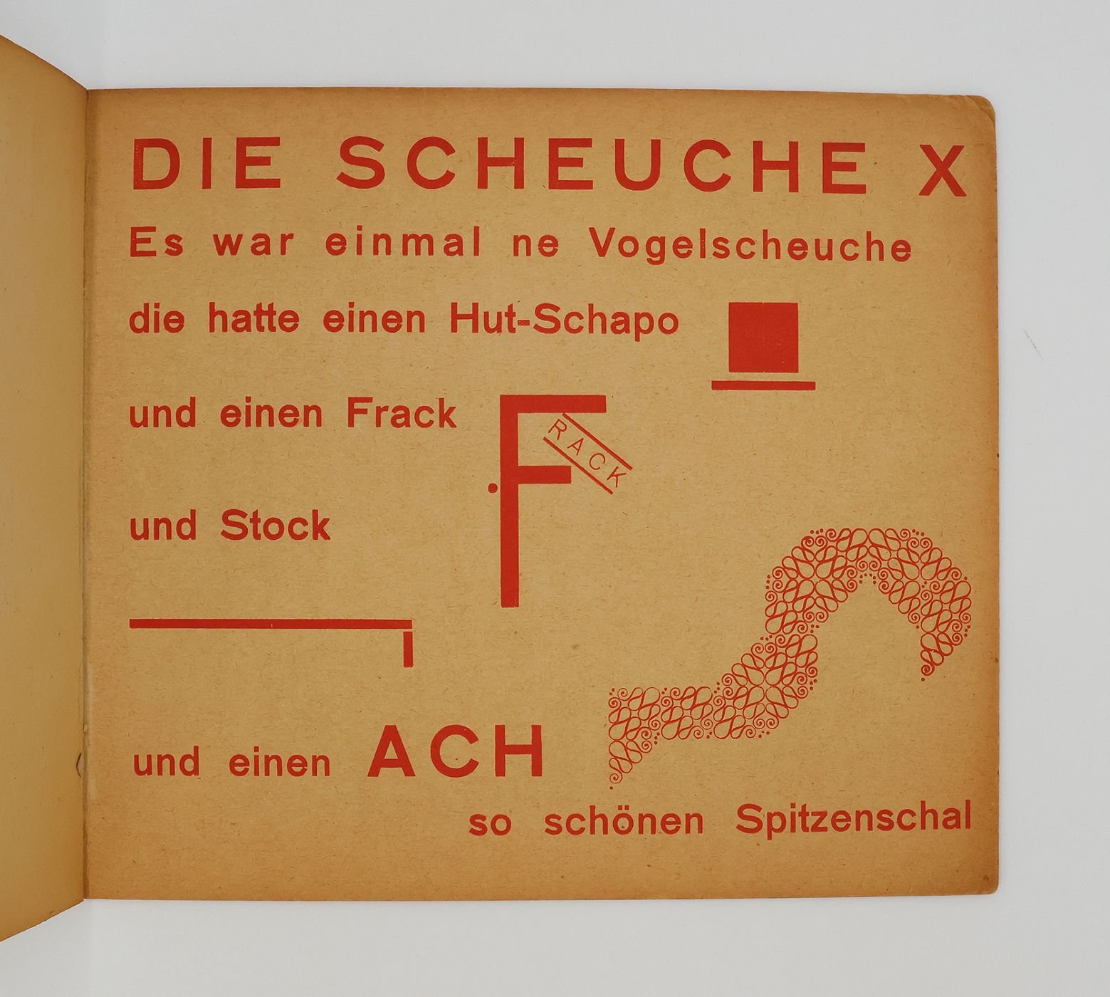
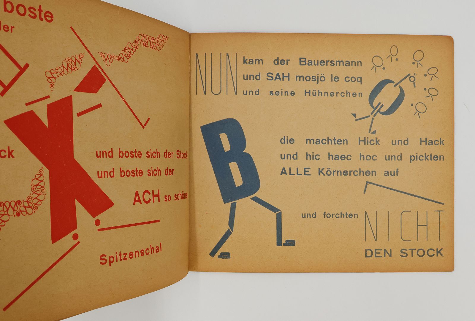
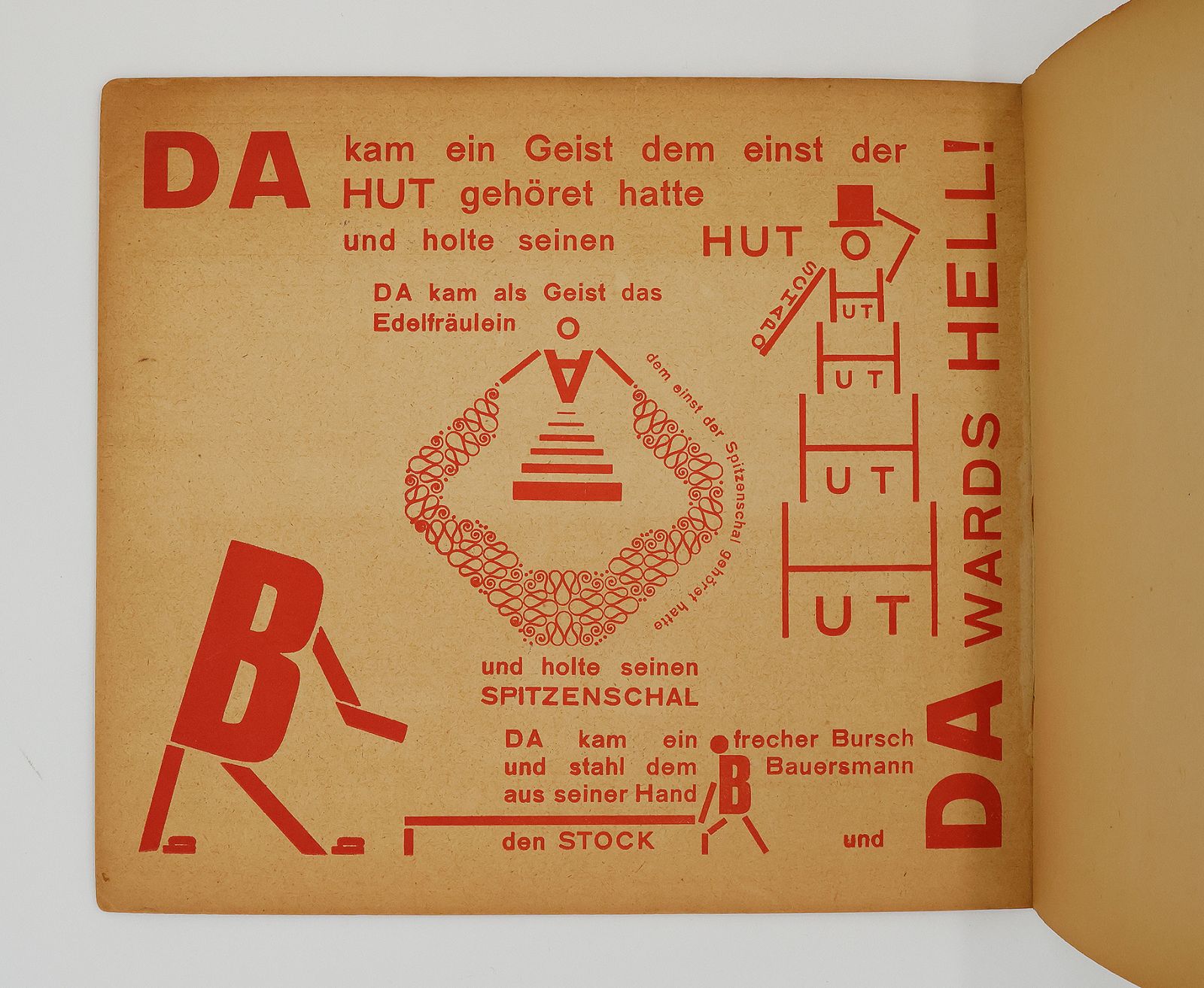
As an influential figure in Dadaism and the subsequent emergence of European Modernism, Kurt Schwitters was at the forefront of radical avante-garde design in the early twentieth century. He coined the term 'Merz', to describe his collage and assemblage works, which used scrap and found materials. Fascinated with language, he founded 'Merz' magazine in 1923, featuring contributions from a variety of creative disciplines, including poetry, art and advertising from key figures in Dadaism, De Stijl and Constructivism, as well as his own collage and typographic work. As an advocate for the 'New Typography' movement and a founding member of 'Ring neuer Werbegestalter' (Circle of New Advertising Designers) in 1927, alongside Jan Tschichold, Laszlo Moholy-Nagy, Walter Dexel [et al], Schwitters explored the creative possibilities of typography and graphic design as art. In 1925 Schwitters co-produced, the typographic children's book 'Die Scheuche: Märchen' (The Scarecrow: A Fairytale) with Theo Van Doesburg, the founder of the De Stijl movement (contributing previously to 'Merz' magazine) and Kate Steinitz, who he had collaborated with on 'Hahnepeter' (Peter and the Rooster 1924) and 'Die Marchen vom Paradies' (The Tale of Paradise 1925). A typographically radical fairy tale was proposed (most likely by Van Doesburg), which would be designed and illustrated purely using type case elements. Schwitters wrote the story of the Scarecrow, with cane, scarf and coat (X), Rooster (O) and Peasant (B), the typographic designs collaboratively created by the trio, with the typesetter Paul Vogt, specially producing letters for the technically challenging book. Issued in three variants. Of the two which are subtitled 'Märchen', one includes the publisher's details 'Aposs No 3 Hannover' rotated 90 degrees counter-clockwise (as here), the other has blank space where the publisher's details would be. The third variant replaces the subtitle with 'Merz 14/15' to coincide with the publication of this work as a double issue of 'Merz' magazine in 1925. The unconventional text arrangement, asymmetrical layout, contrasting colours and variable sans serif type, were in direct contrast to previous publication designs during the 1920s, which were still influenced by the ornamentation of Art Nouveau. A scarce typographic publication from one of the forerunners of modernism and an early example of the radical modernist principles that would provide the foundations for the development of Graphic Design in the twentieth century.
Stock code: 25638
£6,250
Published:
Category
Children's / IllustratedModern First Editions
Original Artwork
Art Books
Recent Acquisitions
Private Press / Fine Printing